Creating a "Masonry-lite" Layout with Tailwind CSS Columns
Overview
While the "true" Masonry layout is currently being drafted for the CSS Grid Level 3 specification, you can achieve a "Masonry-lite" effect using CSS Columns, and if you are using Tailwind CSS, you can do it with just two different classes.
From the MDN Docs - Experimental Technology:
Level 3 of the CSS grid layout specification includes a masonry value for grid-template-columns and grid-template-rows.
Update Note: You can read more about the CSS masonry syntax wars here and how display: grid-lanes seems to have finally won out. Although browser support is still very minimal currently and only in its experimental stage.
The HTML structure & Tailwind classes
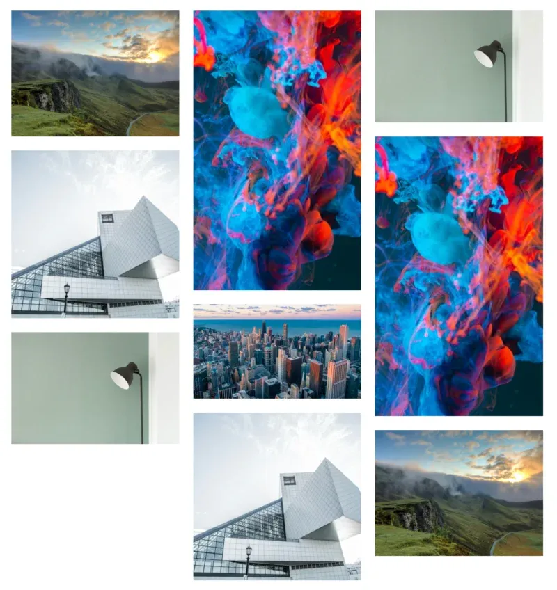
The CSS multi-column layout module was originally designed for flowing text, but it is surprisingly effective for image galleries.
<div class="columns-2 gap-4 md:columns-3">
  <div class="break-inside-avoid pb-4">
    <img
      src="https://images.unsplash.com/photo-1470071459604-3b5ec3a7fe05?auto=format&fit=crop&q=80&w=800&h=600" />
  </div>
  <div class="break-inside-avoid pb-4">
    <img
      src="https://images.unsplash.com/photo-1487958449943-2429e8be8625?auto=format&fit=crop&q=80&w=400&h=400" />
  </div>
  <div class="break-inside-avoid pb-4">
    <img
      src="https://images.unsplash.com/photo-1494438639946-1ebd1d20bf85?auto=format&fit=crop&q=80&w=1200&h=800" />
  </div>

  <!-- More images... -->
</div>
By applying columns-2 (2 columns on small screen sizes), md:columns-3 (3 columns for 768px wide and greater), and break-inside-avoid (to prevent the browser from trying to split the image across columns) to your html, you have instantly created a functional, fluid gallery that adjusts based on screen size.
How It Works
1. Defining the columns
The classes columns-2 and md:columns-3 tell the browser how many vertical columns to split the container into. It will distribute your content vertically until it hits the container's height or flows into the next column.
Refer to the Tailwind docs here Tailwind CSS Docs - columns
2. Preventing the "Split"
By default, the browser might decide to "break" an element to finish a column. For example, the top half of an image might be at the bottom of Column 1, while the bottom half appears at the top of Column 2.
To fix this, use the break-inside-avoid class (which maps to break-inside: avoid-column in standard CSS). When applied to the child elements (the wrappers of your images or cards), it ensures that the element stays whole and moves entirely to the next column if it doesn't fit.
Refer to the Tailwind docs here Tailwind CSS Docs - Break Inside
The "Lite" Trade-off: Flow Direction
In a standard Masonry library (or the upcoming CSS Grid spec), items are ordered horizontally. Item 1 is top-left, Item 2 is to its right, and so on.
With CSS Columns, the order is vertical. Item 1 is at the top of the first column, Item 2 is directly below it, and Item 3 might be at the top of the second column. If the chronological order of your items is vital (such as a blog or news feed), this might not be the best solution. However, for a visual portfolio or an image gallery where the look matters more than the sequence, CSS Columns are a good, zero-JS solution.