Tailwind CSS - Using subgrid to align child content
Overview
As of Tailwind CSS 3.4, CSS subgrids are now available. In this article, we will look at how we can use the new subgrid option to fix a very common layout alignment issue.
As per the MDN documentation:
When you add display: grid to a grid container, only the direct children become grid items and can then be placed on the grid you created. The children of these items display in normal flow.
You can "nest" grids by making a grid item a grid container. These grids, however, are independent of the parent grid and of each other, meaning that they do not take their track sizing from the parent grid. This makes it difficult to line nested grid items up with the main grid.
Step 1: The HTML and Tailwind CSS markup
<!-- Wrapper -->
<div class="grid grid-cols-3 gap-x-8 p-20">
  <!-- Child 1 -->
  <div class="rounded-md border p-4">
    <h2 class="text-2xl">Heading 1</h2>
    <p class="py-4">
      Lorem ipsum dolor sit amet consectetur adipisicing elit. Porro debitis maxime culpa harum
      accusamus eos voluptatem veniam, odio, quibusdam repudiandae quidem reiciendis distinctio
      eveniet quia doloremque? Quasi omnis alias voluptatum.
    </p>
    <img src="/public/images/hero-04.webp" alt="Image" />
  </div>

  <!-- Child 2 -->
  <div class="rounded-md border p-4">
    <h2 class="text-2xl">Heading 2</h2>
    <p class="py-4">
      Lorem ipsum dolor sit amet consectetur adipisicing elit. Porro debitis maxime culpa harum
      accusamus eos voluptatem veniam, odio, quibusdam repudiandae quidem reiciendis distinctio
      eveniet quia doloremque? Quasi omnis alias voluptatum.
    </p>
    <img src="/public/images/hero-04.webp" alt="Image" />
  </div>

  <!-- Child 3 -->
  <div class="rounded-md border p-4">
    <h2 class="text-2xl">Heading 3</h2>
    <p class="py-4">
      Lorem ipsum dolor sit amet consectetur adipisicing elit. Porro debitis maxime culpa harum
      accusamus eos voluptatem veniam, odio, quibusdam repudiandae quidem reiciendis distinctio
      eveniet quia doloremque? Quasi omnis alias voluptatum.
    </p>
    <img src="/public/images/hero-04.webp" alt="Image" />
  </div>
</div>
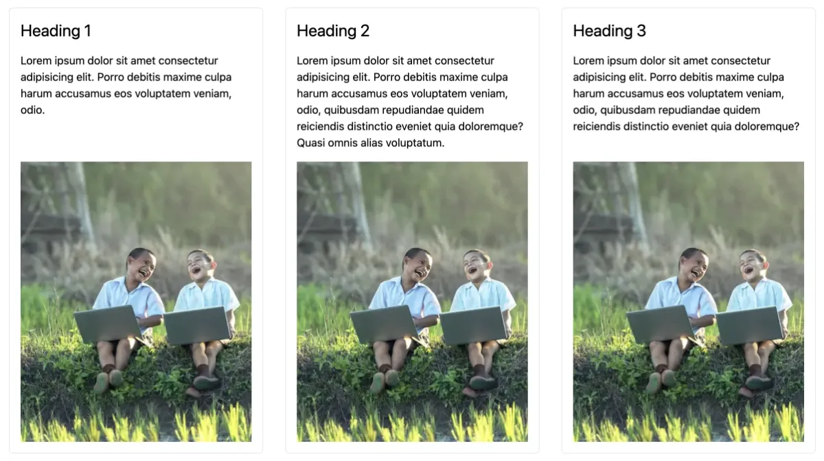
This will produce a 3 column grid as viewed below.
Of course this is an unrealistic scenario where all the text content is exactly the same length. In the real world, each text/paragraph section will most likely have varying lengths which is when we will notice the alignment issues.
Step 2: Fixing alignment with subgrid
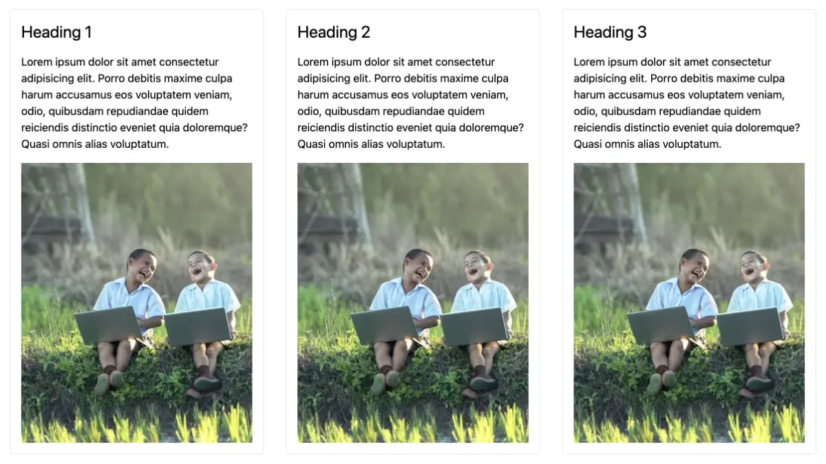
On each child div container, we can now add the tailwind classes of grid and grid-rows-subgrid. Make sure that these classes are added to all the child div containers.
<!-- Child 1 -->
<div class="grid grid-rows-subgrid rounded-md border p-4">
  <h2 class="text-2xl">Heading 1</h2>
  <p class="py-4">
    Lorem ipsum dolor sit amet consectetur adipisicing elit. Porro debitis maxime culpa harum
    accusamus eos voluptatem veniam, odio.
  </p>
  <img src="/public/images/hero-04.webp" alt="Image" />
</div>

<!-- Child 2 etc... -->
However, this will break our layout as shown below.

This is because for each child div container, it is required to specify the start and ending rows so that the grid class knows how many rows we are dealing with.
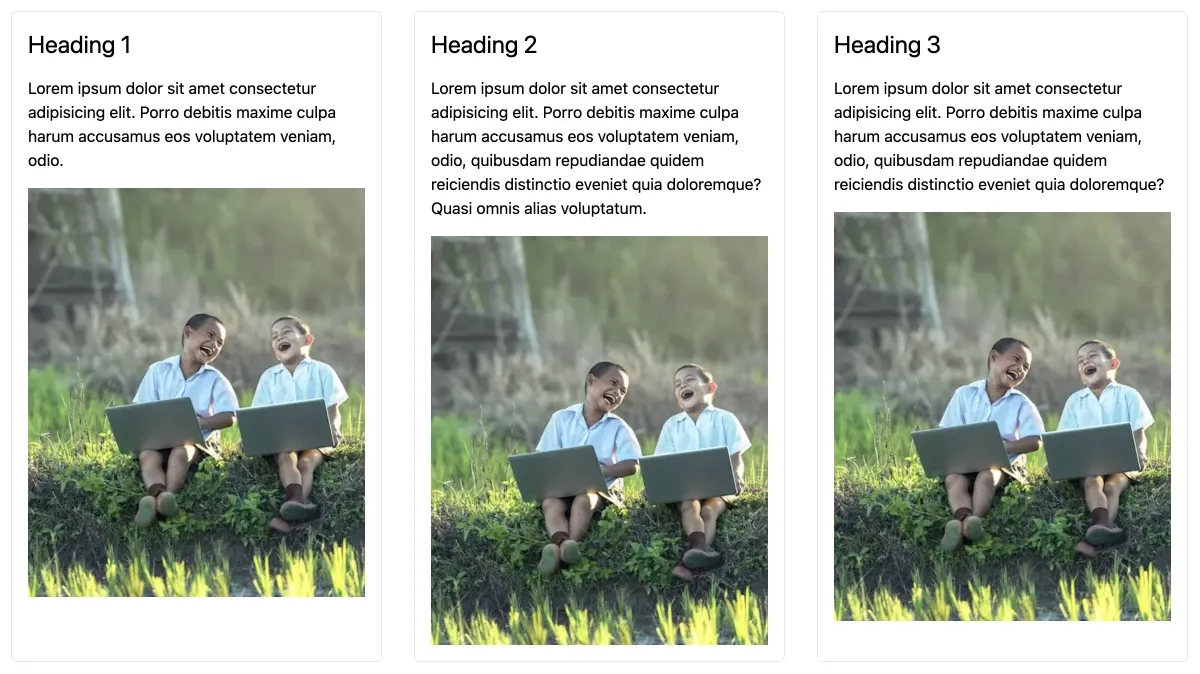
So if we add row-start-1 and row-end-4 classes to each of the child div elements, this will fix the layout.
<!-- Child 1 -->
<div class="row-start-1 row-end-4 grid grid-rows-subgrid rounded-md border p-4">
  <h2 class="text-2xl">Heading 1</h2>
  <p class="py-4">
    Lorem ipsum dolor sit amet consectetur adipisicing elit. Porro debitis maxime culpa harum
    accusamus eos voluptatem veniam, odio.
  </p>
  <img src="/public/images/hero-04.webp" alt="Image" />
</div>

<!-- Child 2 etc... -->
And now we have a perfectly aligned grid layout!